|
|
Post by .drifting feather. on Aug 27, 2016 20:44:27 GMT -5
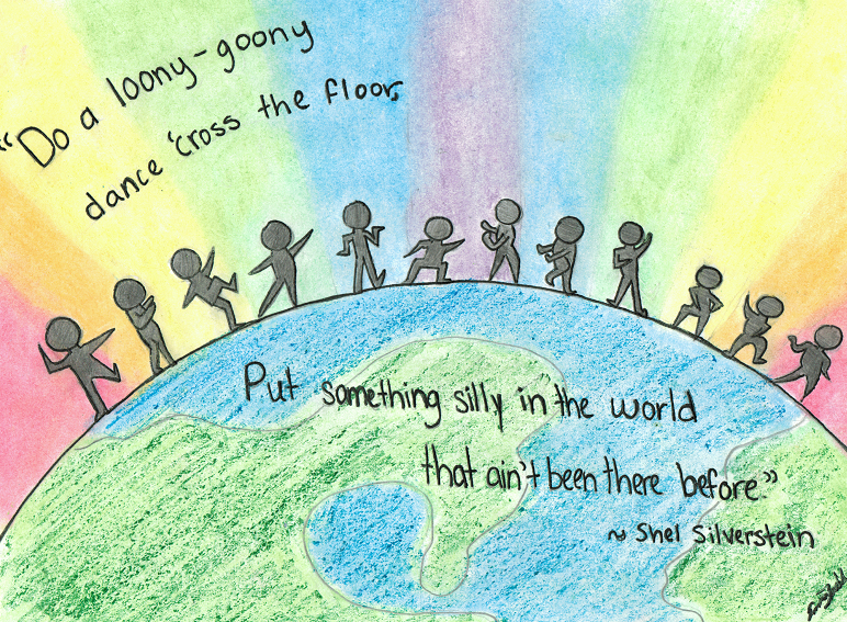
I did this today for a school project, and I was wondering if I could get your opinions on it Please be honest |
|
|
|
|
|
Post by rowanthered on Aug 28, 2016 8:06:16 GMT -5
I love the way the rainbow colors are blended in the background! As Falconfire said, maybe you could do the same for the colors of the earth? I also like the fact that each figure is in a different position  If you intended for them to be silhouettes, maube you could darken them a bit? If you didn't, that's okay! |
|
|
|
Post by .drifting feather. on Aug 28, 2016 8:09:16 GMT -5
Thank you both c:
I did this mostly with chalk and the darker streaks are some crayon that I used to try and darken the earth so the background would pop a bit more. I could try and go blend it in a bit better...
|
|
|
|
Post by rowanthered on Aug 28, 2016 8:15:00 GMT -5
Might I suggest coloring pencils for the darkening? Crayons are great, but they tend to look less uniform, but again, if that's the look you're going for, then just keep it. It all depends on what you like!  |
|
|
|
Post by .drifting feather. on Aug 28, 2016 8:31:55 GMT -5
I never even considered using colored pencil, I might test that out on a separate sheet of paper and then see if i like it, and again, thank you for the feedback!
|
|
|
|
Post by rowanthered on Aug 28, 2016 8:58:37 GMT -5
No problem! |
|
|
|
Post by αɳσɱαʅყ on Aug 28, 2016 15:25:45 GMT -5
Oh man, I love this concept you're expressing! The little people silhouettes performing dance moves go along perfectly with the idea and quote. The choice for a colourful rainbow background was a good one, as it also strengthens your message. Just, it's great!
As for your technique, the use of chalk (?) to blend the background together looks really nice. It stands out, and it's also contrasted with the main focus (darker coloured people figures), which is good.
You mentioned that you wanted for the Earth to be darker. I think your choice of crayons is a decent one, since I do see the need to use a different texture from the background. As mentioned by previous users, the colouring movements you used, however, are a bit too "straight," and it makes the Earth stand out a little more than you intended it to. Have you tried using cross-hatch or circular motions instead?
Also, this is a bit of a nitpick, but I noticed the people started getting smaller from left to right. What's significant about this is that your top-right corner is empty, and the people on the right side are small compared to those on the wholly, complete left. It would be more proportional if the people on the right were a little bit larger, or if you had the top half of the quote span across the entire width. Again, though, this is a bit nitpicky.
Overall, I really like your art! Did you draw your avatar as well? I love your style!
|
|
|
|
Post by .drifting feather. on Aug 28, 2016 15:36:26 GMT -5
Aw, thanks, I did draw my avatar as well c:
I did realize after I had gone over the lil' guys that that they had gotten shorter, wish I could fix it...
I am also trying to fix the straighteness of the crayon lines as well at the moment, If you guys hadn't mentioned it I probably wouldn't have noticed the weird texture.
Thank you so much!
|
|


 If you intended for them to be silhouettes, maube you could darken them a bit? If you didn't, that's okay!

